
The Power BI October 2026 update brings eight changes and one that touches your Fabric bill. Here is what to adopt now, what to watch, and what to leave alone.
The Power BI October 2026 update is a short one. Three headings, eight items, and nothing that changes how you would build a data platform. That makes it a good test of the filter we set out last month in what is worth adopting from a Power BI release, and what to ignore: for each item, is it ready, does it remove a workaround, and will the people who use your reports notice? Here is the October release run through that filter, with the one item that deserves far more attention than it will get.
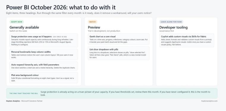
The item that matters: surge protection now sees capacity usage as it happens
Adopt now. Nothing to switch on.
Buried under the Semantic models heading is a change that most readers will skip and that every Fabric capacity owner should read twice. Semantic models now report their capacity unit usage continuously during long-running background operations, such as refreshes, rather than mostly at the end. Microsoft enabled this on 18 August 2026 and it needs no settings change.
Why it matters is surge protection. Surge protection is the mechanism that rejects or delays new background work when a capacity is running hot, so that interactive users are protected. Until now it was working from a lagging view: a long refresh reported most of its consumption when it finished, by which point the capacity might already be saturated and throttling everyone. With continuous reporting, surge protection sees the consumption sooner and can act earlier, rejecting more new background operations before the damage is done and delaying more on-demand work rather than failing it.
Microsoft's measurements from August 2026, for one region, East US 2: proactive surge protection rejections rose from 5% to 12% of the total, delayed-but-accepted operations rose from 11% to 16%, and late-stage throttling rejections fell from 23% to 13%. In plain terms, fewer Monday mornings where every report in the business slows down because one overnight refresh ran long.
It does not change the advice in our plain-English guide to Fabric capacity. You still need to know what runs on your capacity and when, and surge protection is still a blunt instrument that says no to work rather than making it cheaper. But the platform has got better at protecting you from your own workloads, and that is usually the most you can ask of a platform change. If you have surge protection configured, review your thresholds now that they are being evaluated against a truer picture. If you have never configured it, this is the month to look.
Gantt chart as a core visual
Watch. Preview, so not on production reports yet.
Power BI finally has a Gantt chart that is not a custom visual. It plots tasks on a time axis with bar length for duration, progress formatting, milestone markers, colours cascading by category, optional extra columns for fields such as owner or status, and a zoom axis so readers can focus on a window and return to the full range. You can set the start and end of the axis, the date format and the units shown. It is enabled in Power BI Desktop under File, Options and settings, Options, Preview features, followed by a restart.
For the many organisations paying for a third-party Gantt visual, or avoiding Gantt charts altogether because of the AppSource approval conversation, this is good news. It is also a preview. Our rule on preview features has not changed: build with them in a development workspace, not in anything a director opens on Monday. The sensible move this month is to put the preview side by side with whatever you use today and note the gaps. One early question in the comments on Microsoft's post, whether planned and actual dates can be shown together, is unanswered, and that is exactly the kind of gap to find before you commit.
List slicer dropdown with selections as pills
Watch. Preview.
The list slicer gains a dropdown mode for long lists. Selected items appear outside the dropdown as pills, each with a dismiss button, and when space runs out a count pill shows how many more are selected. A "show selected first" option pins current selections to the top of the list, and the button slicer gets the same option. The dropdown keeps the list slicer's item formatting, and you can size the drawer and format the search box.
The behaviour worth knowing before you use it: if you choose Select all and then clear a few items, the cleared values appear as "Not (item)" pills, meaning those values are excluded. If you select all and clear nothing, it behaves as no selection and does not filter other visuals. That is sensible, but it is a different mental model from the slicers your users know, so it belongs in a report with a clear visual language. Our visual interactions checklist covers the rest of what to check before a slicer change goes live.
Personal bookmarks keep column widths
Adopt now. Generally available.
Small change, large number of support tickets. Personal bookmarks on tables and matrices now preserve column widths, including columns the user has reordered and resized. The finance user who spent ten minutes setting up a table on Monday gets the same table back on Friday. There is nothing to configure beyond telling your users it now works, which is the part most teams forget.
Auto-expand hierarchy axis with field parameters
Adopt now. Generally available.
Bar, column and line charts can now auto-expand a hierarchy axis when more than one column sits on it, matching what slicers and matrices already did. More usefully, the hierarchy axis now works with field parameters, so one field parameter slicer can switch both a chart axis and a matrix hierarchy between, say, country, segment and product, without duplicating visuals. Viewers can drill up, drill down and move across levels from the slicer, and the same holds when they use Personalize this visual. The toggle is in the X-axis Values section of the format pane. If you have ever built three copies of a chart to give users three levels of detail, this is the month to delete two of them.
Chart plot area background colour
Adopt if you need it. Generally available.
Bar, column, line, area, combo, ribbon, waterfall and scatter charts can now take a solid fill colour on the plot area, with a transparency slider and, more interestingly, conditional formatting driven by a measure or field. That means a chart background that turns amber when a KPI is off target without a separate card visual. Use it sparingly. A plot area that changes colour is a strong signal, and like all strong signals it stops working if every chart does it.
Copilot adds custom visuals through the Report Authoring skill
Leave alone for now, unless you are already using Skills for Fabric.
The Power BI Report Authoring skill, part of Skills for Fabric, can now add custom visuals to a report from a natural language request, bind them to data, format them and validate the result. It works with custom visuals already in the report, including ones imported from a file, and it can suggest an AppSource visual when the core visuals cannot do what you asked. Microsoft's pitch is that it saves the fiddly work of finding visual identifiers and troubleshooting field mappings, and that is fair.
Our hesitation is not about the technology. A report that needs a custom visual chosen by an agent usually needs a design conversation first, about whether the custom visual is wanted at all, who approves it, and how it behaves in the Service. Those are governance questions, and an agent that makes adding visuals easier does not answer them. If your organisation has a custom visuals policy and a developer team already working through Skills for Fabric, this is a time saver. If not, the policy comes first.
The pattern in a quiet month
Three of the eight items are generally available and worth switching on this week: bookmark column widths, the hierarchy axis changes, and plot area colour where you have a use for it. Two are previews to trial in development: the Gantt chart and the slicer dropdown. One is a developer tool whose value depends on governance you may not have yet. And one, the surge protection change, is already live on your capacity whether you read about it or not, and is the only item here that touches the bill.
That is a reasonable month. Not every release needs to be a headline, and a platform that quietly gets better at protecting your capacity is doing more for you than one that ships a new visual. The discipline is the same as ever: adopt what is ready and removes a workaround, trial what is preview, and leave the rest until there is a reason.
Hopton is a Microsoft Solutions Partner building and running governed Power BI and Microsoft Fabric estates for organisations across the UK and Ireland. If you want a second opinion on what to switch on, or on how your capacity is behaving, talk to us or start with a free audit.
Related reading
FabCon Europe 2026: what to adopt now, what to watch, and what to leave alone
Pyramid, Power BI or Fabric: Which One, and When
Power BI reports can now write back: what that actually changes
Maisie Hudson
Data Consultant
Part of the Hopton Analytics team, delivering governed analytics programmes for UK mid-market organisations.